

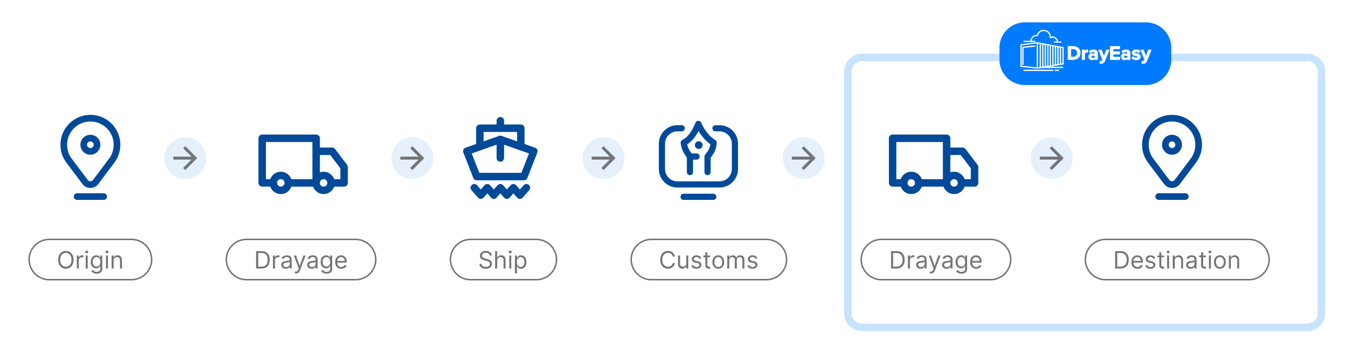
DrayEasy is an online platform that specializes in providing freight forwarding and logistics services.
After the order, container tracking and next taking actions are really important for their users (Freight Forwarder)
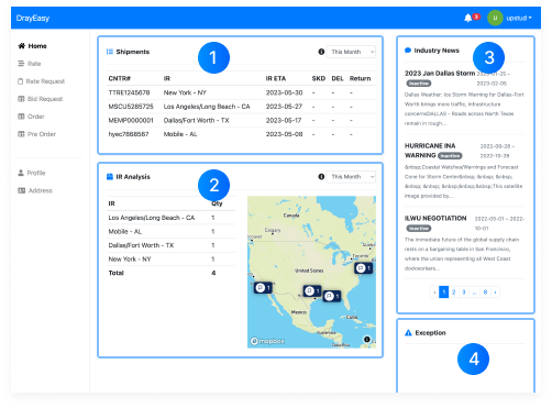
The current DrayEasy dashboard is a minimum viable product that only contains basic functions. The company uses e-mail as the service method as they expect to use a developed platform. Our challenge is to ease the user's understanding and make it easier for them to use. This effectively translates into meaningful business outcomes like increasing conversion rates.
bolstered with advanced filtering and search functionalities for container monitoring

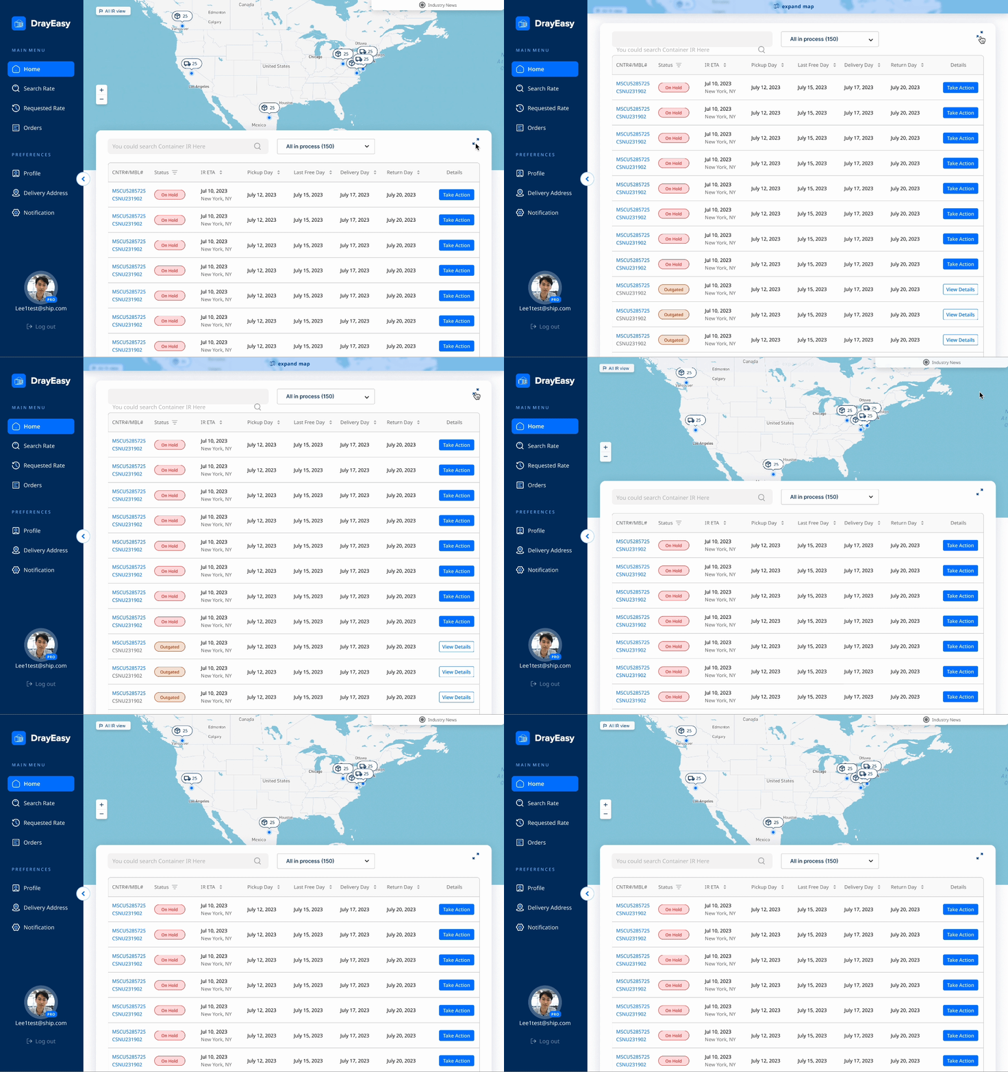
1. An integrated tracking system dynamically connecting maps and lists
Fragmented arrangement of information, lack of integration
DrayEasy does not have many interaction clickable buttons or filters to show more shipping process informations to users.
Problems:
Integrated, Dynamic, Intuitive
An integrated tracking system dynamically connecting maps and lists, bolstered with advanced filtering and search functionalities for container monitoring
Advantages:
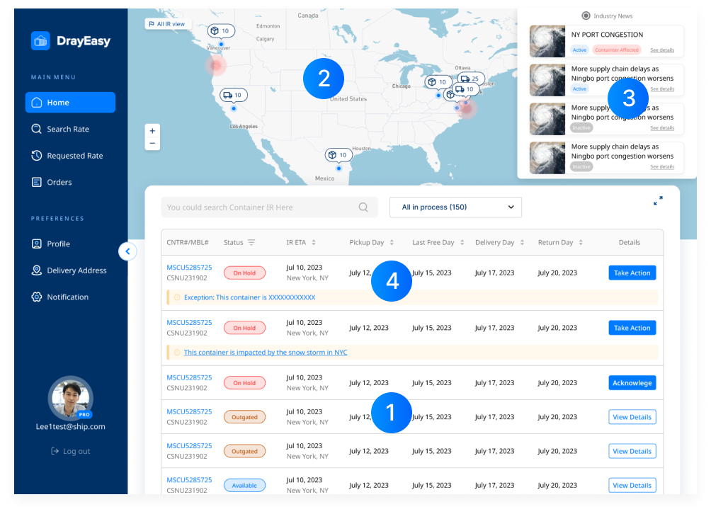
2.By centralizing 'Action Required' notifications and adding tailored action buttons, user awareness and responsiveness is enhanced
Delayed, Inefficient, Cumbersome
Taking actions and receiving notifications through emailing customer service
Problems:
Always Available, Eye Catching, Proactive
By introducing 'Action Required' notifications and distinct action buttons on each container list item, users are proactively guided towards important tasks and information
Advantages:
The client has confirmed the design will be released on the new platform version.
Through user feasibility testing,
reduction in the time users take to track target containers
reduction in the time users take to complete actions based on testing
Through interviews with experts and stakeholders, we have identified the current pain points of users
I researched some competitors’ dashboards to find inspiration.
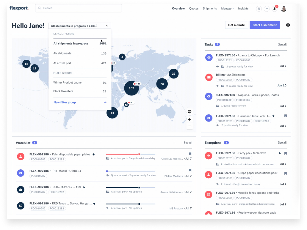

I researched some competitors’ dashboards to find inspiration.

30 yrs old | San Diego, California | Freight Forwarder
Brainstormed on the functional modules of the homepage, after evaluation, I have some good ideas💡
💡Industry news has an interaction with map.

Full width map is better to show more information and interaction.
table is better


How can users receive 'take action' notifications promptly?
Users can immediately view recent urgent tasks and proactively take actions.

a card-based design to highlight urgent tasks that users need to be aware of immediately.
✅a card-based design to highlight urgent tasks that users need to be aware of immediately.
❌Cards take up too much space
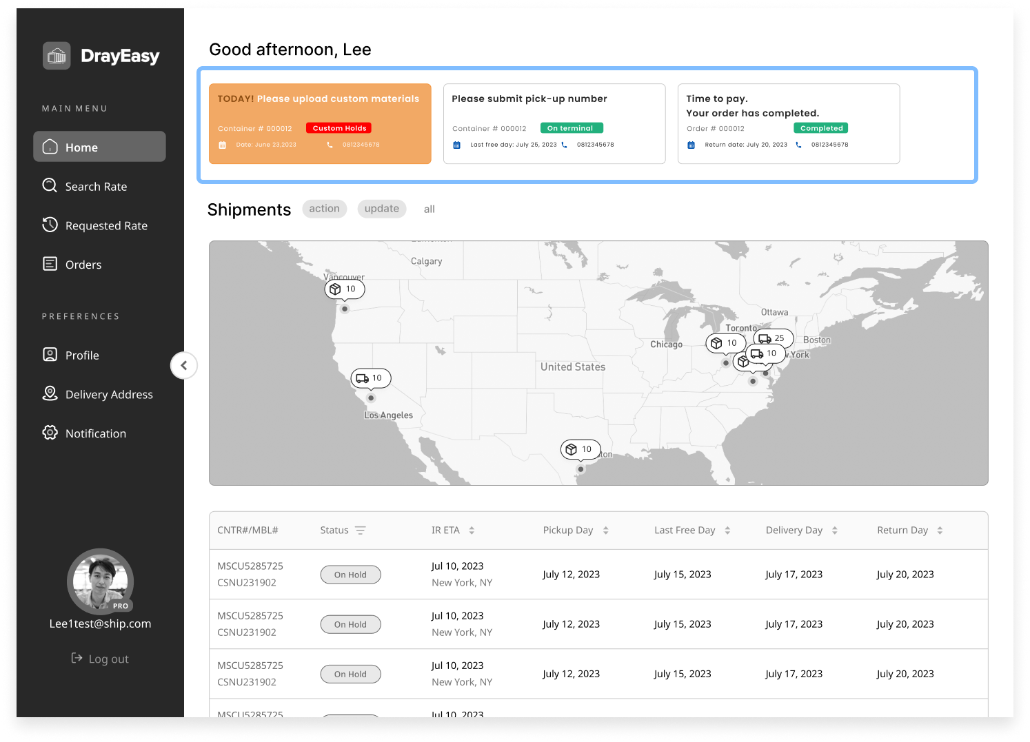
a card-based design to highlight urgent tasks that users need to be aware of immediately.
✅a card-based design to highlight urgent tasks that users need to be aware of immediately.
❌Cards take up too much space
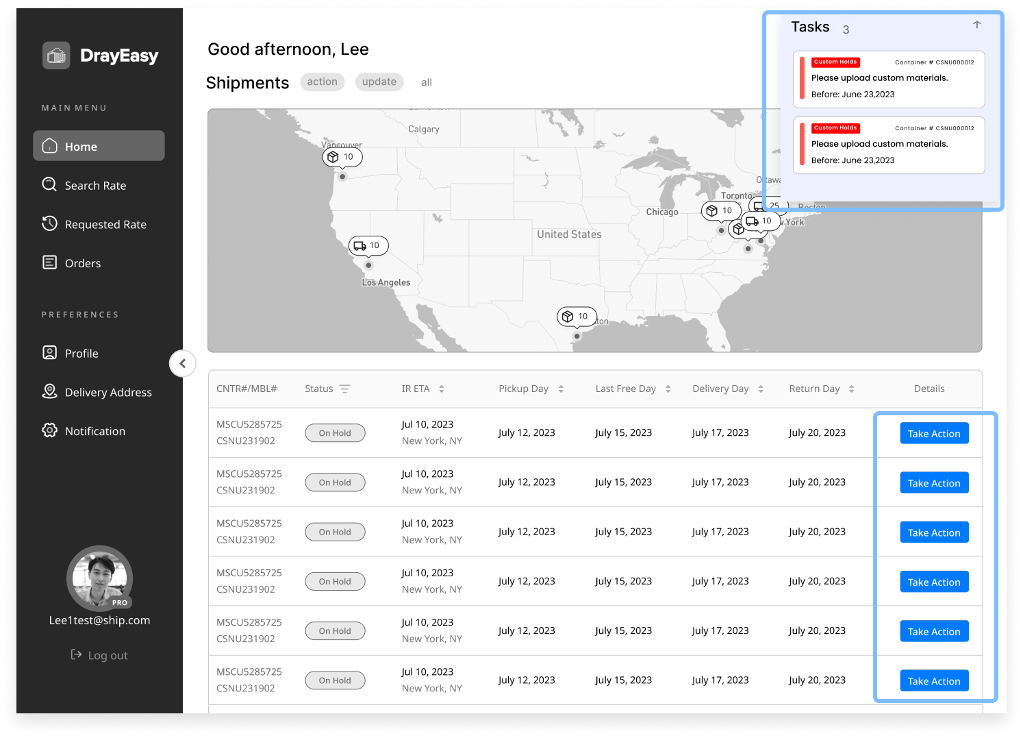
a card-based design to highlight urgent tasks that users need to be aware of immediately.
✅a card-based design to highlight urgent tasks that users need to be aware of immediately.


a card-based design to highlight urgent tasks that users need to be aware of immediately.
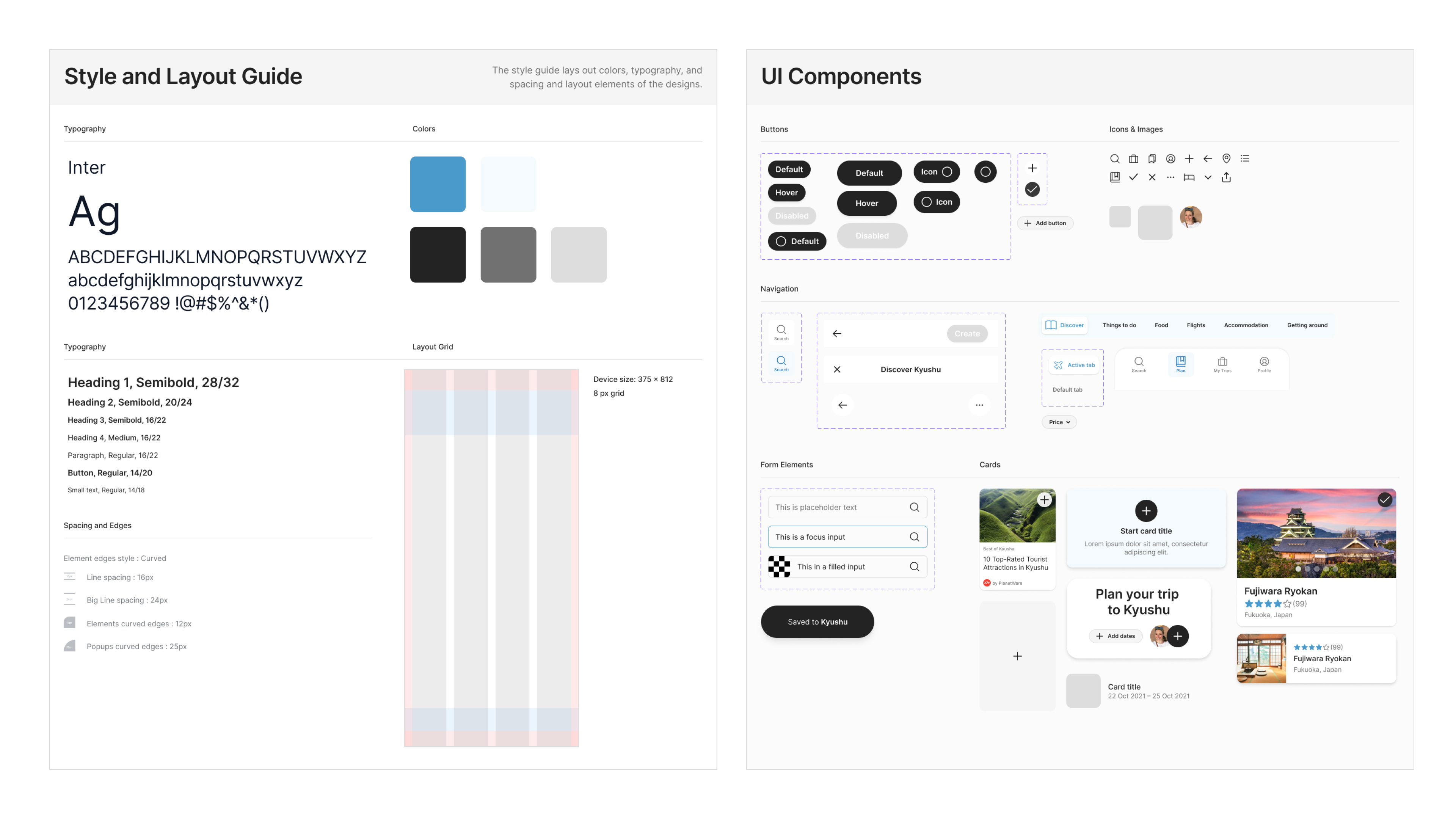
After setting up color and text styles in Figma, I started to build a component library to maintain consistency across the designs. Components were setup using auto layout to make sure they are scalable across different screen sizes.
Through interviews with experts and stakeholders, we have identified the current pain points of users
.gif)
While carrying out this exercise I had to make assumptions and trade-offs in order to make progress and stick to the timeline. Here are a few of the constraints and trade-offs that I considered: